Showing posts with label Epson. Show all posts

Tuesday, November 16, 2010

Scanning with the Epson V500

Scanning film with an Epson Flatbed

Like most film photographers I need to scan my images in order to post them on forums or to my Flickr account.
This tutorial centres around getting good quality output from a very cheap consumer scanner the Epson V500. There are better scanners but for web display and even small prints from medium format its a pretty good scanner.
I'm also going to scan with the free software that comes with the scanner,keeping it as simple as possible.
Firstly set the software to work in 'Professional mode' this ensures you have control over the important settings. I use the software though Photoshop TWAIN module so images jump into PS after scanning– it can also be used as a stand alone program.
The important settings are set out below:


I feel the most important settings are:
Scan in 48bit (24 if your image editor only works to lower bit depth)
Resolution at 1200 gives output that can be used either for small (up to 8") prints or web images. At time of writing I feel that 1200 is the most useful setting for scanning as 2400 doesn't yeild much better images but increases scan times.
Set the original and destination (output) athe the same values–this should be the default.
In the adjustments section I disable unsharp mask and gran reduction as I prefer to do manipulation in Photoshop.

After you have made your pescan a viewing box opens, at this point the scan often looks sub-optimal so the first thing I do is highlight the image area I wish to scan.

Next I hit the histogram adjustment button which is the second one in the adjustments pallete:

This brings up another pallete which looks like this:


Notice The histogram window at the top? That represents the tones in the pre-scan scan, if you look carefully you'll see the white triange (lightest tones) has a little information  to the right. In other words it 'clips' the highlight tone and if you look at the actual image you'll see actual image shows the clipping as missing or 'blown' highlight detail.

To remedy this you take the white triangle and move it to the extreme right of the histogram info, like this:


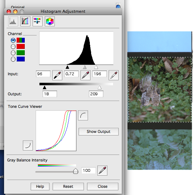
The whole image looks dull, but the upside is that most of the info will now be scanned. If you hit the 'show output' button you will see a histogram of the final image that will be imported into Photoshop.
From there you can make all the adjustments, levels, colour, sharpening etc

This tutorial isn't supposed to be scanning 101 just a guide to what works for me, trying to set the black and white points to avoid clipping and doing most post in PSCS.
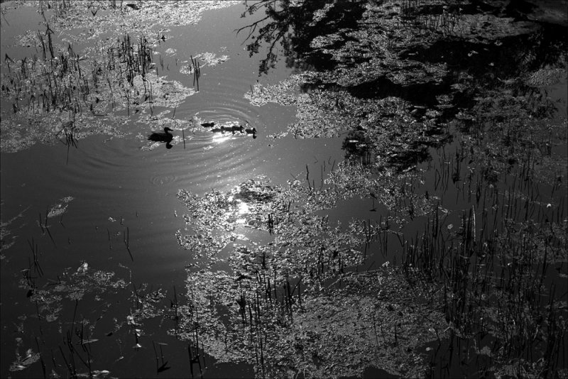
The finished image can be seen at the top of this post.

© Photo Utopia 2010

Thursday, November 09, 2006

More Paper Tests


This morning yet more packages of paper arrived, some A3+ Fotospeed Fineart gloss and a test-pack of Hahnemühle paper.
After downloading the ICC profiles from the Hahnemühle site, I set about testing their "Photo Rag" papers.
The paper has a heavy weight feel and is slightly heavier than my reference Fotospeed paper at 310gsm.The surface is rough looking and to my eyes at least; a matt finish (even on the Satin Photo Rag)
I fired up my 2400 Epson and printed of one of my files that exhibits the kind of dense blacks I need for most of my subject matter.

Below is a side by side comparison with the Hahnemühle Photo Rag Satin at the top, Fotospeed paper bottom.


I had expected so much from this paper, if I'm truthful I was very disappointed, pretty much everyone I'd heard say anything about this paper from seemed to be full of nothing but praise.
I'll quote from a UK dealers web site:

'The most important paper for photographic reproduction in the Hahnemuhle range, and tends to be the first choice from the point of view of the best 'photographic' look. Other papers in the range might be selected because of their surface characteristics - Photo Rag is popular because the surface intrudes the least'


Well OK, but I'm seeing a pretty intrusive surface, not at all 'best photographic look' in fact the maximum black is pretty average.
I know it's a Satin finish and my reference is gloss, and for some people this paper may be just what they are looking for especially if they do a lot of high key studio work or for an artist who wants a pastel or softer look.

Unfortunately this paper is not for me, my quest for a paper that looks like the silver FB papers of old continues...

All images and text © Mark Smith 2006

Monday, October 16, 2006

Printing My Images


Well I finally did it, I bought myself an ink-jet printer. After the recent closure of my favourite Pro-lab I was left in somewhat of a dilemma, just how was I going to get my images onto paper?
Previously I'd been more than happy with my Lab (I had worked there and was a partner for a few years), they'd supplied me with profiles for all their machines and their digital and conventional work was spot on.
I have had quite a bit of experience with printers of all kinds over the years and the thought of moving over to ink-jet printing wasn't something that worried me.
I had after-all been working with digital imaging for over ten years and my choice of printer would be one that I'd often used and seen good results from- the Epson R2400.
The order was duly placed with my retailer, along with some Epson Paper.
First impressions are good, especially the B&W mode which although isn't as good (with the papers I've tested) as a fine art silver print, is relatively free from colour artifacts.
The Epson canned profiles are quite good when printing though Photoshop, description here
All that needs to be done now is to find a good exhibition grade "B&W silver gelatin look" paper, one that gives me the depth that I used to get from my wet darkroom.