Saturday, September 08, 2012

Goodbye Fotokemika

A 1980's Roll and the current EFKE/Adox

With all the attention focussed on Kodak's recent decision to sell their film business, the news Fotokemika (EFKE and Adox film brands) have decided to cease production may have slipped under the radar for some people.

Fotokmika have been making a range of films and papers since the 1960's when they bought the machinery (but not the trade name) from Adox.
My previous post outlines the company history for those inclined here.
The coating machine was made in the 1950's and pretty much the film produced on it is unchanged from that period and made to the original Dr. Shleussner formula.

A box of 1957 R17
Recently Fotokemika made the distributor aware that they had problems with their coating machine which needed to be repaired, after consideration I think they decided although they could fix the machine, that their business margins were so thin they feel they have to cease all production.

Possibly the factory site is worth more money than they can hope to earn from film so they have decided to cash in their assets.

For most photographers that used these films that is a great shame, they were unique and has a very different look from modern films.

I have been using them various guises since the early 1980's anyone in the UK will surely remember Jessop pan in the plain white boxes for just a pound.

I particularly loved the 50 ISO version of this emulsion, which had smooth tones and  easier to tame and more forgiving than the 25 version.
I will miss the films very much, at the same time I'm grateful for being able to use them for the last 30 years.

©Photo Utopia 2012


Friday, August 24, 2012

Keep it–with Kodak


This morning over breakfast I learned that Kodak's current management team are divesting themselves of their chief asset and for most people their most recognisable product–their film division.

The current state
Kodak over the last 10 years have consolidated the production plant, it is now the most efficient film coating facility in the world–it can't downsize any more because only building 38 is left as far as I know they have two coating lines–the film division is profitable.
Edit: Kodak are still making film, they haven't 'killed it off' like some people in digital camera forums have suggested, production continues while they look for a buyer.

So what next? 
This situation is a make or break one for Kodak Film, the positive being the fracture between top board members who have been hammering the giant into the ground pursuing the consumer ink-jet market and those on the ground who passionately believe in their great product. Once these two have parted company those who run the film division and actually believe in film should be able to reach consumers, meet their needs and hopefully develop the niche.
The negative being that the economy is bad, costs of raw materials like silver are rising pushing up the cost of the end product in a time where people have less disposable income.

Who could buy the division?
It is hard to see another film based company buying the plant with rising costs and sale.
In the current climate no one is going to want to expand, so that leaves us with a venture capitalist possibly backed by money from business or some party with a large interest.
But remember how GM nearly collapsed, yet people are buying cars sad fact is people aren't buying so much film–the one player with the best quality product is profitable but not well managed.
The next six months will tell us how it will 'pan' out. (intended pun in quotes) 


© Photo Utopia 2012

Monday, August 13, 2012

The Artist Zacron


The following text and images are a tribute to the artist Zacron whose best known work is the Album cover for Led Zeppelin III.
© Zacron
I recently discovered that my friend the artist died in January of this year, his death wasn't announced until this August which is why I'm only now posting this tribute to him.
I first met him at an artists exhibition about ten years ago, a larger than life character in a white suit and hat. We chatted briefly about art and photography both of which he was notably passionate, about the changes that were happening in the world of photography, digital cameras, photoshop and how this had caused a change in my work.
Later that year we met again at a party where I offered to help him set up a digital workstation in his studio, I still remember his flamboyant 'that would be marvellous' answer to my offer of help in teaching him Adobe Photoshop.
   I spent many hours with him at his studio discussing art and photography as well as helping him learn Photoshop, something he took to like a duck to water. 
He was a very talented guy who worked with all types of media, never shy of learning new methods or mixing them with old ones. He had a keen interest in all sorts of subjects from the artistic education of students through to music and film (he had a fantastic cinema in his house).
He was a kind and thoughtful man, great artist and friend, I will miss him very much–god bless you Richard.

The devil is in the detail
© Photo Utopia 2008
In the workshop
© Photo Utopia 2008

With the famous 'rotator' in the background
© Photo Utopia 2008
Rock & Roll Soul
© Photo Utopia 2008

I took these images back in October 2008 with my Rolleiflex loaded with Neopan 400. 

© Photo's and text Photo Utopia

Tuesday, June 26, 2012

In Praise of Rodinal part II

In my previous Rodinal worshipping post I discussed some of the history and properties of the ancient liquid formula.
In this post I hope to describe some of the harder to define reasons why Rodinal is my developer of choice.

The characteristics of Rodinal
Rodinal is not the finest grained developer in the world, if minimising grain at all costs is your goal then there are better options available. That is not to say it is 'grainy' with care it can give fine grained results similar to developers such as D76/ID11.
 I have heard many photographers over years that have been disparaging of Rodinal based upon it being a 'grainy' developer, I'n not sure this is the case my tests show a more 'tell it like it is' rather than having too many solvents or other grain blunting properties.

My Personal Rodinal Journey
In truth my first impressions weren't that great, not bad but certainly not good enough to displace the Ilfotec HC and Paterson Acutol products that had become my standard.
So what changed my mind?

In the late 1980's UK Photographic firm Jessops started supplying their 'own brand' B&W films which were made by Fotokemika (EFKE) these films were cheap (one pound for a 120 roll).
I really struggled to find a good developer combination, Acutol was about the best but I seemed to get inconsistent results the contrast seemed too high, lowering ASA ratings and times didn't work as I'd hoped.
One day I ran out of Acutol and had to do a shoot of a band on a Sunday afternoon, the only 35mm mono film I had was Jessops KB21, looking in my darkroom cabinet I saw a little 125ml bottle of Rodinal and in a that'll have to do attitude I decided to use the stuff.

I wasn't prepared for the results I obtained, smooth tones, sharp edge definition-surely this couldn't be the cheap 'quid' film I'd been struggling with?
Here are the shots....


With all the other developers I'd got good sharp negatives but I'd never seen mid tones quite as attractive, the combination worked and I'd stumbled upon it.

Rodinal works very well indeed with the traditional cubic type flms like Adox/EFKE especially those in the 25-200 ISO speed group, characterised with high accutance and smooth tones.

Dilutions and their effects on image results


Delta 3200 'pushed' to EI6400 

One of the greatest properties is how well it works at different dilutions, 1:25 which I only use for faster films like Ilford Delta 3200 I feel that this dilution although OK doesn't fulfil the potential and can give slightly grainy results, in fact it might make some users ask 'whats the fuss about this developer".

I feel the best dilution is 1:50. At this dilution Rodinal excels at bringing out a beautiful mid range brilliance, tonally I find it hard to beat as if it somehow provides more separation.
The most amazing property is that at higher dilutions the highlights are without equal, the  way it seems to preserve highlight information as well as the shadow detail is uncanny.
With higher dilutions a compensating effect makes the diffuse highlight (last decernable detail on paper) and the specular highlights which are close to paper white never clash, giving a glow that often makes images look three dimensional.
All this is hard for me to put into words, I see it in the print the following images are an attempt to show this in the digital domain (although monitors may not give you the range, you might just get a rough idea)


Click on the images to get a higher resolution version

Both images on Ilford HP5 400

The images above don't really do the prints justice, but serve to show my points, the white wall and the girls hair are in full sun yet the hair (in the print at least) retains detail.
Likewise the beach scene which although not as bright still retains good highlight separation.

The final dilution I use is 1:100 which brings into play 'edge effects' especially when combined with less agitation, you get them to some degree at the 1:50 but 1:100 with agitation of one inversion per minute really makes them noticeable.

Agitation and the effect on the image
Rodinal has one other incredible property–low agitation causes few or no processing marks. I know of no other developer that lends itself to this technique better, most other developers will suffer from bromide drag (marks from the sprockets or film edges) Rodinal seems much less susceptible in this respect.
In fact I'd go further, it seems to have better highlights-shadow and certainly less grain at higher dilutions with less agitation. I have found a slow roll (rather than complete inversion) for 1 minute followed by a slow rolling 'inversion' every following minute is the sweet spot for me.

Pushing with Rodinal
Yes it can be done, although some feel it isn't suited to this task and may prefer speed increasing developers such as Microphen– Rodinal can actually be quite a surprise.

The secret is to expose for emerging shadow detail then stop down two stops (I'd do this with any negative film developer combo). Once you've exposed correctly a high dilution and low agitation will give good results here is Fuji Acros 100 exposed at EI800 and developed for twenty two minutes at 1:100 with my standard agitation.


The above was shot at 1/8 second with little or no light apart from the standard lamp n.b how the highlights have been retained. Yet you can still see the name of the beer on the glass and some shadow detail.
The most probable effect is one of highlight compensation from the high dilution coupled with low agitation allowing the highlights to exhaust the developer while the shadows 'catch up'

Conclusion
Rodinal is no panacea I don't wish to give that impression, some will decry its portrayal of grain in fast films (which I like) Just try HP5 or Tri-x in a diluted solution it will give superb tonality and a hint of graininess. 
Neopan 400 low light Rodinal 1:50

The developer has many strong points, long life, high dilution, compensating effect, edge effects etc.
Rodinal is a very capable developer, really works well with slow to medium speed films and gives a brilliance of tone in the upper highlight transition.

© Photo Utopia 2012

Thursday, April 19, 2012

Photographers that inspire: August Sander

August Sander was a German portrait photographer in the early 20th century. His photos have always attracted me because of the stark and direct nature of his subjects beautiful and yet slightly uneasy viewing.
He seems to have a directness of connection with the subject which although gives intimacy at the same time, the sitter almost always has a steely reserved distance.
His photographs are a 'slice' of German society before the war, including country peasants, musicians, writers and aristocrats. Here are some of my personal favourites:


Police Officer

Country Girls


Circus Performer

Student


Turkish mousetrap salesman
Actress
             
He published a book in 1929 called 'Face of  Our Time' (links to Amazon) which forms the basis of his an exhibition of his work 'People of the 20th Century' The book was not well recived by the Nazi's who destroyed some of the plates and negatives. Sanders images were probably too 'transparent' in the kind of society they showed, not exactly the modern image of Germany the Nazi's wanted.
August Sander's style has influenced many of his later 20th Century contempoaries such as Lissette Model and Diane Arbus the latter especially.
The Book Face of our time is a must for any portrait photographers bookshelf.

©Photo Utopia 2012

Wednesday, April 18, 2012

Fuji Pro 400H


I've been using versions ( originally called Fuji NPH) of this film since the late 1980's when we used it for weddings and portraits and over the years the different versions have remained constant in their character, the latest version is Pro 400H.
The films main strengths has always been the fine grain and neutral colour rendition, albeit with slightly higher contrast than some rival companies emulsions.
One of the films particularly fine characteristic is it's rendition of light skin tones, where some might emphasise the red component 400H gives a 'creamy' skin tone almost similar to the old Ektachrome 64 Pro but without the coolness in blue/green areas. The Pro H is certainly less contrasty and smoother in tone than say Fuji Superia 400 or Kodak Gold similar to the old Agfa XPS 160.

sand, skin tone and sea all look very natural


Along with it's slightly constrained colour pallete the film has very fine grain for a 400 ISO emulsion, probably not quite as fine as Kodak's new Portra 400 but so close as to be considered equivalent in many uses. Double click on any of the images to open a larger sized photo.

Just a rough idea of the films grain structure


One of the benefits of being colour neutral and being able to record wide tonal ranges is that under certain lighting (early and end of day) you can get a almost three dimensional effect without excessive shadows or contrast although lighting and lens coatings will also play their part, in the above photo 400H clearly does help too.
In summation Fuji 400H is a fine emulsion, available in both 35mm and medium format, certainly one of my favourite colour films.


©Photo Utopia 2012

Thursday, February 03, 2011

Agfa Portrait XPS 160


 This particular film is no longer in production, so you'll have to excuse this post for a certain level of sentimentality as Agfa Portrait was probably my favourite ever film.

I think the film was first introduced in the early 1990's a part of the 'Agfa Triade' which consisted of three emulsions Ultra 50 which was a high contrast & saturation film, Optima 100 which had a normal saturation and Portrait 160 which had a lower contrast and saturation. Later they added an Optima 200 as well and dropped the 'Triade' moniker.
Here is a schematic of the layer structure:


Agfa Portrait had a very natural colour rendition and because of its lower contrast it captured white wedding dress detail even in the brightest of conditions. I also remember it having excellent latitude to over exposure with detail in overexposed areas easily recoverable four stops over, it couldn't be underexposed I'd say half a stop at the most.

I used this film mainly for weddings where the aforementioned detail in the whites coupled with very nice skin tones nearly always gave great results. I think it is one of the most natural colour films I've ever used.

 
Cool natural tones
 
I found a small amount of this film which expired 2007 on a well known auction site and just had to go on a little trip down memory lane and have had fun revisiting an old favourite.
I had forgotten the peppermint flavoured 120 roll seal :)

© Photo Utopia 2011

Friday, January 28, 2011

Found Film — 127 Kodacolor VR200


First a confession, I was given this film about 5 years ago, promptly put it in a draw and forgot about it.
It is a Kodak VR200 in 127 format dating from somewhere between 1982-90. I think the Kodak VR range were the first to use the T grain type emulsions, and were superseded by the Gold range in the late 1980's
Often people who find old colour films decide to process in B&W as either the process is no longer available or they think the colours will have faded anyhow.
As I have been processing my own C41 I decided there would be no harm loading up the old film, and as you can see by the following images they aren't too bad considering the film was loose wound and at least 20 years since exposure.
This looks familiar, probably East coast-possibly Sheringham or Cromer


It looks like a bed and breakfast holiday on the East Anglian coast, probably taken with a folding camera. 

© Photo Utopia 2011

Thursday, January 20, 2011

Processing Your First Colour Negative Film


Its not as hard as you think!
In these days of ever shrinking film market we often find ourselves looking for a good photographic lab for colour work which can sometimes be hard. So if you can't find one why not have a go yourself? There are some excellent kits now available from Tetenal, Rollei and Fuji-Hunt.


 Quite a few of you will already be processing your own B&W so already own  most of the equipment needed.
Hold on I hear you say-isn't colour processing complicated?

Processing colour negative film is as easy as B&W in fact in a lot of ways it is easier. The equipment you need for C41 negative is exactly the same as B&W with the exception of the thermometer which will need to go up to 40°C.
As the development time is the same for all C41 films 3 mins and 15 seconds the only hard part is keeping the developer at the standard 37.8°C ± 0.2°C
My method for keeping the developer is to use a water bath which I heat with a cheap fish tank heater which keeps the solution at the required temperature.
I use a 1L C41 kit which has three baths, Developer, Bleach/fix and Stabiliser (final rinse)


Here is my method:
I place the developer bleach-fix and stabiliser in the plastic washtub which I then fill with warm water at about 35°-40°C (around 100°F) I then switch on the tropical fish tank heater which maintains the temperature.


Then load the tank as you normally would with B&W film.


The chemicals need time to come up to temperature and stabilise, so put your thermometer in the developer bottle and keep an eye on it, the C41 developer is rated at 37.8°C (100°F) but half a degree either side won't matter.
Once up to temp, fill a clean container with water at 38-39°C this water will be used for  pre-soaking the film, which will help to keep the developer up to temperature by warming the tank and ensure the developer goes evenly over the film.
I pre-soak for two mins and while I do this I get ready my timer ( a watch with second hand is fine) and a pen and paper to note the passing time.


Pour out the pre soak water (it will be a coloured liquid, which is normal) and slowly pour in your developer (should take 15 seconds) and start your timer and initial agitation of about 15 seconds-tap the tank to dislodge bubbles.


Important Note: It is easier to use the agitation stick with some models like the Patteson System 4 you can keep the thermometer in the tank by placing in the centre of thestick. If you use inversion method after the initial agitation the air inside expands so you'll need to crack off the lid to let the warm air out-or risk leaks!


Keep an eye on the time as agitation should be every 15 seconds either by 2 inversions or twists of the agitation stick. During this time I prepare another jug of water at 35°-39°C which I use as a non standard wash to prolong bleach life.
The developer time for fresh solution is 3 minutes 15 seconds, so after the 3 min time take off the lid and slowly pour your developer back into the holding bottle(a funnel can help here), then put in my previously prepared first wash (you can use acid stop bath) which should be at the same  temperature (within a degree or two) as your processing solutions.


Agitate the wash/stop for 15-30 seconds then empty. Next pour in your Bleach-fix which should be over 35°C (as close to you developer temperature as possible) and agitate for a full minute then tap.
Remember to release the air if you use the lid and inversion


Prepare another jug of wash water at least 35°C.
Further agitations at 30 second intervals until the 6 min bleaching time is completed (you can't really over bleach-fix.
When finished pour the bleach into its holding tank and pour in your warm wash water and agitate for 1 minute, pour out the wash then re-fill with another warm wash and repeat until you've done this step five times.
Next pour in your stabiliser-don't agitate! just leave for one minute before taking out your film and hanging to dry.
N.B The stabiliser is the final bath, no further washes or wetting agents should be used.


That's it you're done! I actually find it easier than B&W, give it a go practice on cheap film/test shots until you're confident, but colour is nothing to worry about.
Here is an image developed from a Tetenal kit:


Notes:
Developer is the most critical step, keep the temperature as close to the target 38°C as you can. Developer times should be extended by 15 second after every 5 films, a 1L kit should do 12-15 films.
If you process a lot of 400-1600 films take the lower figure of 12 as they exhaust the developer faster-you kit should have more information.
 Quite a few of these kits say "for rotary processors' but can quite easily be used for normal tanks as long as agitation is given every 10-15 seconds (not all commercial processors have constant agitation)
Developer changes colour from honey-gold to pinkish brown this is normal, in well sealed bottles should last 4-6 weeks its main enemy is air.
Keep developer away from all other chemicals especially bleach if you contaminate the developer with bleach-discard it (follow your countries laws about disposal)
Bleach likes air just before use, in fact commercial labs pump air though the bleach to condition it- I shake my bottle before use to get air in the solution.
Extend the bleach time to 10mins after you've processed 10 films.
Stabiliser will go from clear to pink during use-this is normal.


©Photo Utopia 2011

Wednesday, January 05, 2011

Ensign Ful-Vue


The Ensign Ful-Vue is an English box camera manufactured by Houghton-Butcher. Early pre-war versions were simply a box with a larger than normal viewfinder. The copmpany re-designed the camera in 1946 giving it an 'aerodynamic' look which still looks quirky today. The version above is from about 1950 and is a Ful-Vue II with a flash socket just to the right of the lens.

The body is made of pressed steel making the camera robust but quite light, the viewfinder is a separate unit also made of pressed steel. The shutter housing is made of a Bakelite type material held on by three screws making shutter and lens removal easy (more later)
The left hand side has a locking knob which when twisted to 'unlock allows the right hand side panel to be removed for film loading/retrieval.

Inside is a baffle and film holder, the Ful-Vue takes standard commonly available 120 film and has a red window for viewing frame advance.
All simple stuff, one shutter speed and aperture mean little control coupled with a simple lens that has three position scale focus 2, 5-3 and 6 to (I'm assuming feet).

My camera when it arrived had what I call a 'lazy shutter' in other words it had an intermittent non firing, but armed with some help from a Flickr member 'Full-Vue' I was able to take apart and clean the shutter.
After cleaning and re-assembly the shutter works fine, I didn't lubricate the simple mechanism I just gave it a polish.
In the winter in the UK with a box camera you really need a 400ISO film as I'm betting the shutter is about 1/60 and the lens probably f8 or 11.


The above was shot on a very dull cold day on Fortepan 400 developed for 1hr in Rodinal 1:100 stand.
I like the camera for its 'quirkyness' and simplicity, the big viewfinder looks great almost like a TLR in size and brightness, and for the times when you want a simple box with a lens-fun!


©2011 Photo Utopia

Monday, December 06, 2010

In Praise of Rodinal (Part 1)


History 
Rodinal in one form or another has been available to photographers for over a century. Originally produced by Agfa it can now be found in many different guises Adox/Calbe/Foma RO9 all basically now the same developer.
In fact Rodinal has become a bit of a cult developer, some even make their own using Paracetamol


 Rodinal is one of my favourite developers, it is compensating when mixed in larger dilutions like 1:50 or 1:100 this also makes it very economical and to cap that it seems to last forever without going off in its undiluted state.
(although this is only true with undiluted solutions, once diluted I'd personally use the mix within the hour).


While most other developers are useless when they go a dark straw colour, Rodinal remains useable regardless of colour – I have used the stuff when it was black, just take a look at the picture at the top of this article.
I can find no difference in developer activity between new bottles and ones where the solution is the same colour as Cola!


I first used Rodinal in the early 1980's when I worked with a photographer who demonstrated its qualities on a roll of APX developed at 1:50 shot on his 1950's Rolleicord.
At the time I thought he was quite mad as he decanted the tiny amount of black liquid from what looked to be an old brown glass medicine bottle with rubber stopper.
His results were wonderful, with a long range of tones and very sharp, it wasn't long before I had purchased my own bottle (though it came in a plastic bottle)


Rodinal apart from lasting longer than most photographers life spans, also has the advantage of being very economical as it can be used highly diluted 1:50 (1 part concentrate to 50 water) being my favourite; but anywhere between 1:25-1:200 can be used as long as you don't use less than 10ml of concentrate according to Agfa guidelines.
In reality those are pretty conservitive and I use 5ml as my minimum, and this seems to work well as my developer tank needs 500ml for a 120 film so the maths isn't too hard.

Above is the classic combination of APX developed in Rodinal 1:50

Recently the producers of Rodinal have lost the right to the name as a trademark, I have it on good authority that it is produced in the same factory in Germany but is now known as R09 'one shot' the new label seems to state it quite clearly:

Produced as Rodinal for Connect Chemicals (ringed in red) for any that harbour doubts. In  part 2 I'll give some more examples of Rodinal in practical use as well as possibly showing some tests of how it differs from other developers, results from pushing film, and why I feel it makes a good choice for stand development.


© Photo Utopia 2010

Friday, November 26, 2010

Found Film: 1970's Ilford FP4

Every so often I'm given a little photographic archaeology project, films that have been left in cameras or draws, for over 60 years in some cases!
The film I've been given this month is a roll of 120 Ilford FP4.
The film is still in production as FP4+ but this roll probably comes from the early production 1970-79 from the packaging.

What developer to use always inportant with old films and I favour Rodinal or HC110 as they give lower base fog which tends to be worse with films that have been stored for many years.
I processed this film in Rodinal 1:50 (10ml concentrate in 500ml water) for 15 mins with agitation of one inversion per min. 

The film had about five 2¼ square images, two of which were of a boys hockey team at the local park the rest of someones back garden.
Looking at the  hair, clothes and the fashion I'd guess these were taken between 1974-76 which means they have been sitting waiting for processing for 35 years.
The camera was probably a folding type as the images were left to right along the film.
I'm guessing the camera owner was probably the guy lying down in the second shot.
I wonder why people leave these undeveloped?

© Photo Utopia 2010


Monday, November 22, 2010

Filmwasters

The Filmwasters are a group of individuals who share a passion for all things film. They have forums, both audio and video podcasts, print exchanges etc.I'm a member of the forum myself, and can attest that they are a friendly bunch who have a wide range of photographic interests from toy cameras, Polaroids alternative process etc.

Take a look at the Filmwasters

Tuesday, November 16, 2010

Scanning with the Epson V500

Scanning film with an Epson Flatbed

Like most film photographers I need to scan my images in order to post them on forums or to my Flickr account.
This tutorial centres around getting good quality output from a very cheap consumer scanner the Epson V500. There are better scanners but for web display and even small prints from medium format its a pretty good scanner.
I'm also going to scan with the free software that comes with the scanner,keeping it as simple as possible.
Firstly set the software to work in 'Professional mode' this ensures you have control over the important settings. I use the software though Photoshop TWAIN module so images jump into PS after scanning– it can also be used as a stand alone program.
The important settings are set out below:


I feel the most important settings are:
Scan in 48bit (24 if your image editor only works to lower bit depth)
Resolution at 1200 gives output that can be used either for small (up to 8") prints or web images. At time of writing I feel that 1200 is the most useful setting for scanning as 2400 doesn't yeild much better images but increases scan times.
Set the original and destination (output) athe the same values–this should be the default.
In the adjustments section I disable unsharp mask and gran reduction as I prefer to do manipulation in Photoshop.

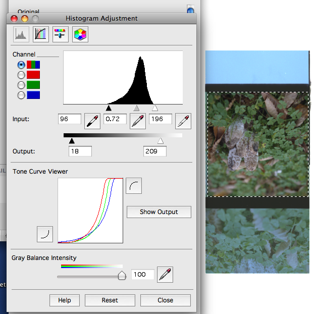
After you have made your pescan a viewing box opens, at this point the scan often looks sub-optimal so the first thing I do is highlight the image area I wish to scan.

Next I hit the histogram adjustment button which is the second one in the adjustments pallete:

This brings up another pallete which looks like this:


Notice The histogram window at the top? That represents the tones in the pre-scan scan, if you look carefully you'll see the white triange (lightest tones) has a little information  to the right. In other words it 'clips' the highlight tone and if you look at the actual image you'll see actual image shows the clipping as missing or 'blown' highlight detail.

To remedy this you take the white triangle and move it to the extreme right of the histogram info, like this:


The whole image looks dull, but the upside is that most of the info will now be scanned. If you hit the 'show output' button you will see a histogram of the final image that will be imported into Photoshop.
From there you can make all the adjustments, levels, colour, sharpening etc

This tutorial isn't supposed to be scanning 101 just a guide to what works for me, trying to set the black and white points to avoid clipping and doing most post in PSCS.
The finished image can be seen at the top of this post.

© Photo Utopia 2010